
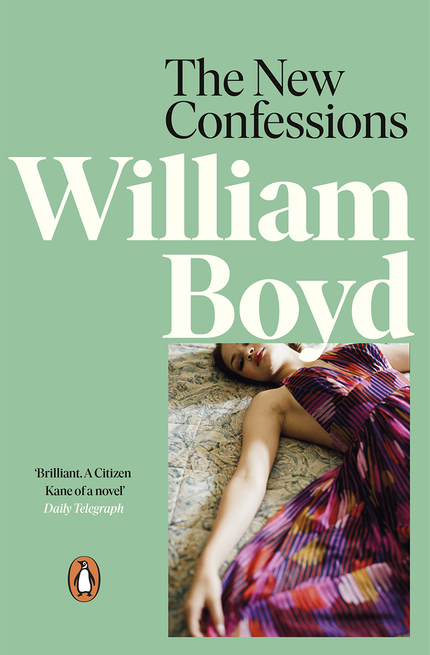
‘An often magnificent feat of story-telling and panoramic reconstruction … John James Todd’s reminiscences carry us through the ups and downs of a long and lively career that begins in genteel Edinburgh, devastatingly detours out to the Western Front, forks off, after a period of cosy family life in London, to the electric excitements of the Berlin film-world of the Twenties, then moves on to Hollywood … to ordeal by McCarthyism and eventual escape to Europe’
Peter Kemp, Observer
Alternative Editions
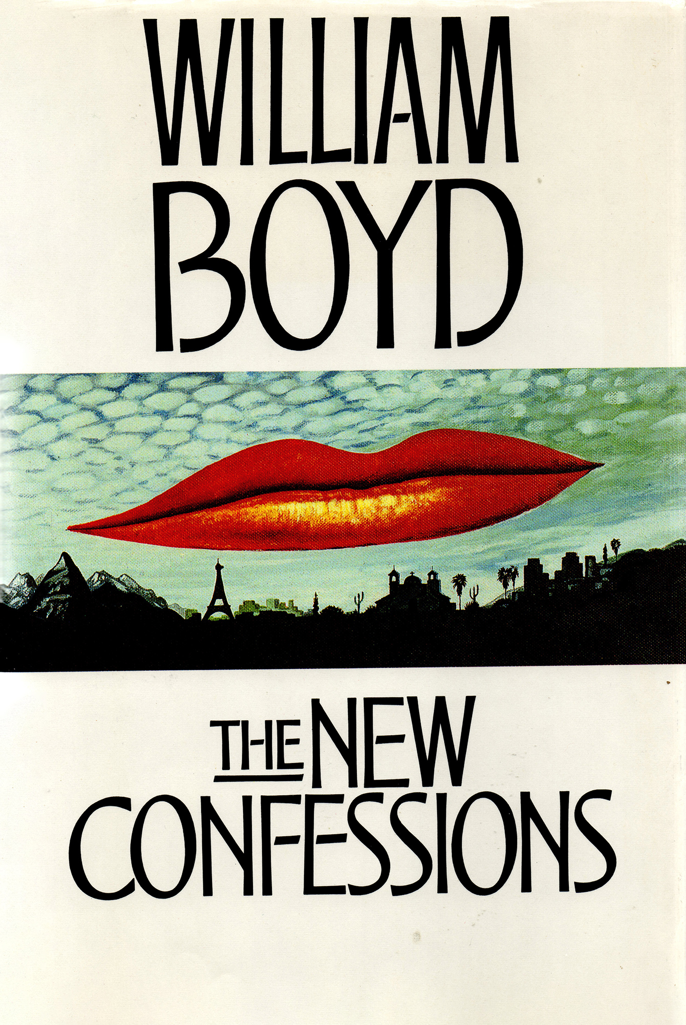 |
UK first edition
Design: The Beaver Design Company This novel saw the beginning of a lasting relationship with a brilliant designer, Robin Rout. Robin had been hired by my wife, Susan, in her capacity as head of publicity and marketing at Heinemann and, it’s fair to say, his truly stylish book jackets for Heinemann in the 1980s transformed the somewhat lazy design standards of the British book trade. I suggested he adapt Man Ray’s famous painting “Observatory Time: the Lovers” – an image of a giant pair of red lips hovering over a dusky landscape. It looked sensational – and Robin had even come up with an original font for the lettering. The only problem was that after the book was published the Man Ray estate sued Hamish Hamilton for plagiarism and was only pacified by a payment of £5000 – that was 1987, about £18,000 today. To his enduring credit Christopher Sinclair Stevenson did not rebuke me – though I know he was mightily pissed-off at having to pay for, quite possibly, the most expensive jacket on a novel ever. Having paid the money, however, the jacket was used on many of my foreign editions so Hamish Hamilton may have recouped some portion of their investment. However, in the US, Fred Marcellino came up with another beauty (shown below). One of my favourite covers, ever. |
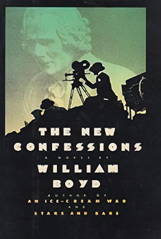
US first edition
|
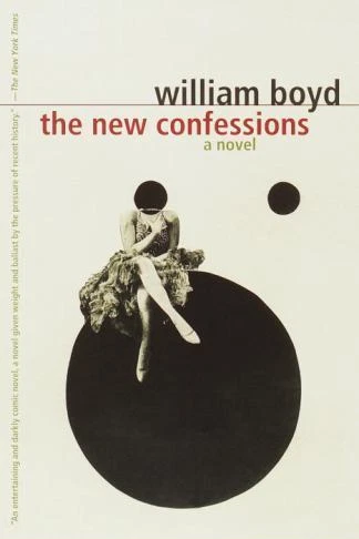
US paperback
|